Styles and components
A global styles library for Design Studio, not more templates
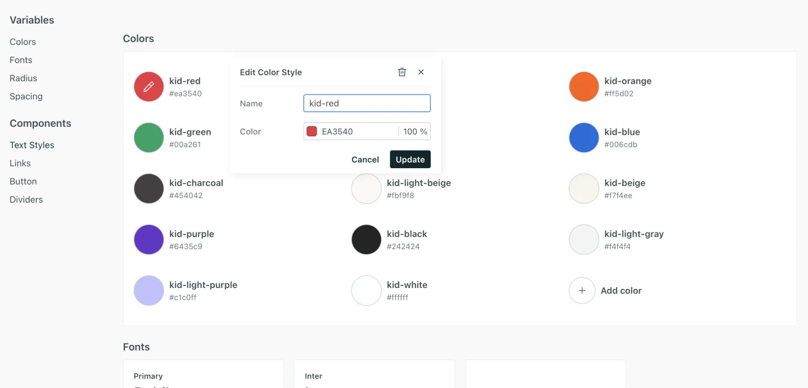
Design Studio’s global styles library is what actually fixed brand consistency. A team defines foundational styles and style components once, and every message built afterward inherits them.
The challenge
Customers told us what was wrong:
“If you looked at our emails today? I’m sure 90% of them have like slightly different text color or text size.”
There were no reusable blocks or templates, so it was hard to scale content or keep it consistent. Whatever fixed that needed to hold up over years of emails built by different people, not just look right in the first one.
What I owned
The design of the global styles system within Design Studio: foundational styles, style components, custom components, and later variants, plus the interaction model for defining and applying them inside the editor.
Decision 01 / 04
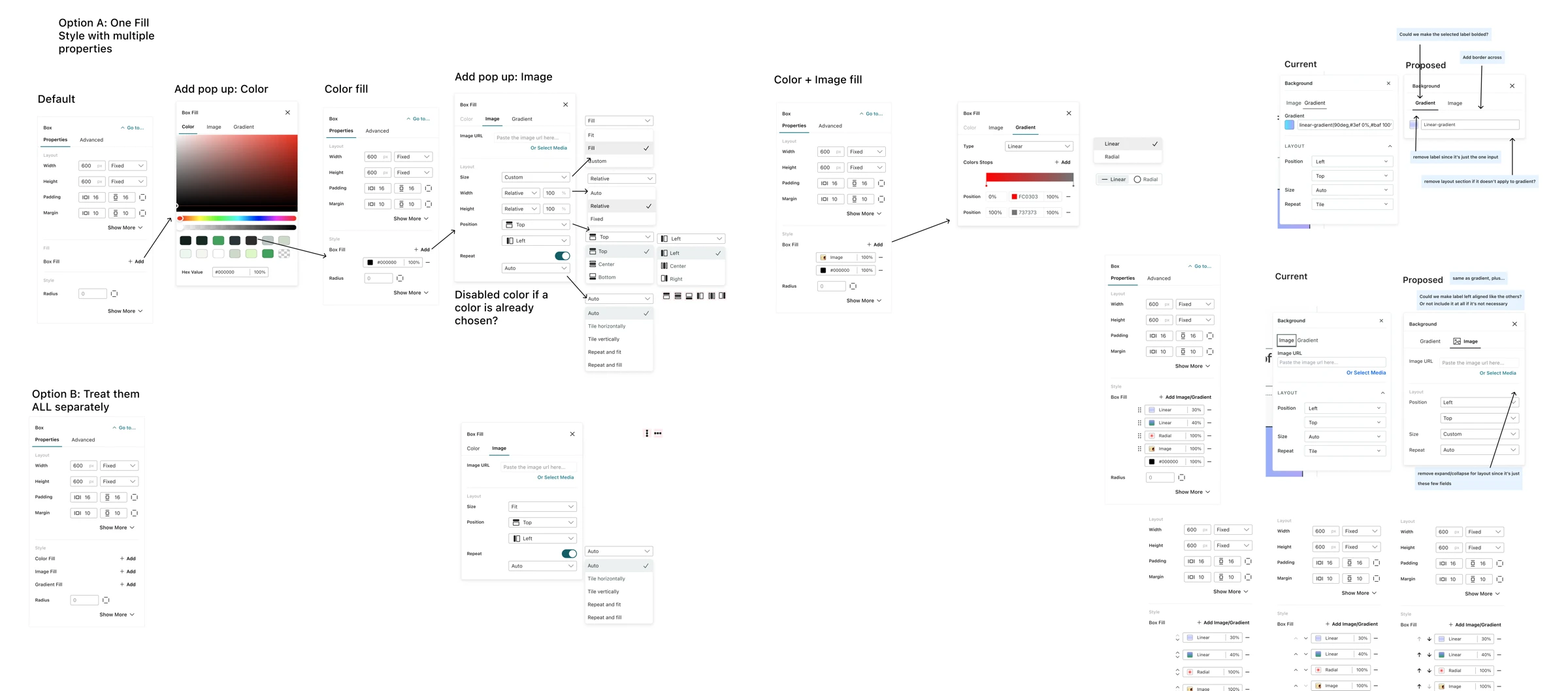
Styles as a system, not a setting
Considered
Consistency could have been solved with better templates. Templates are simpler to build and much easier to explain.
Decided
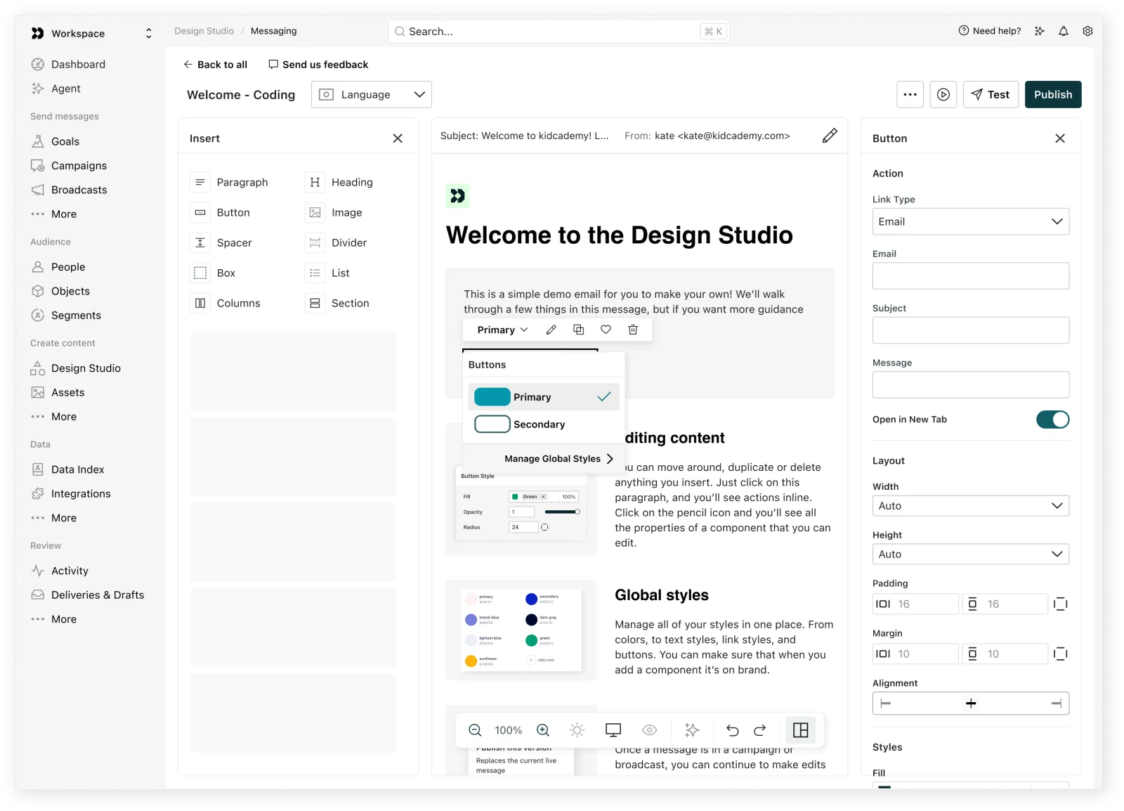
I went with a global styles library instead, where a team defines foundational styles and style components once and reuses them everywhere. We later extended it to variants, so a team can hold more than one branded look for the same component.
Templates freeze a design at the moment you make them. The customer whose emails all had slightly different text colors needed something that propagates when it changes. Variants shipped as one of our longest standing requests.
Decision 02 / 04
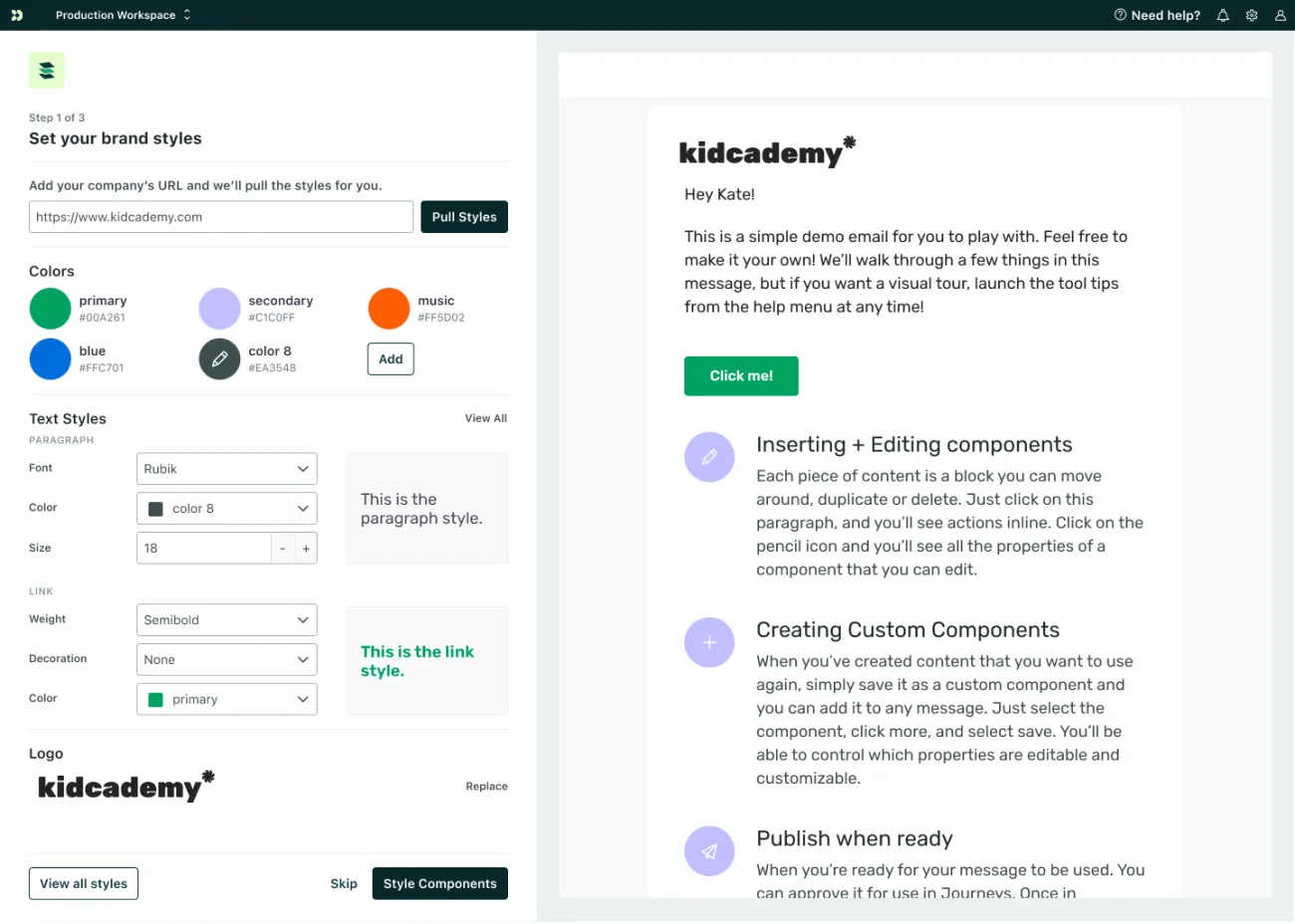
Styles can be deleted, but never lost
Considered
If a user deletes a style, remove it from all instances, or default those instances to black.
Decided
Deleting detaches a style into its hex value or number value instead, so no existing messages are affected. This is explained to a user the moment they hit delete.
This decision cost more engineering time, but it prevented customers from accidentally changing hundreds of messages with little warning.
Decision 03 / 04
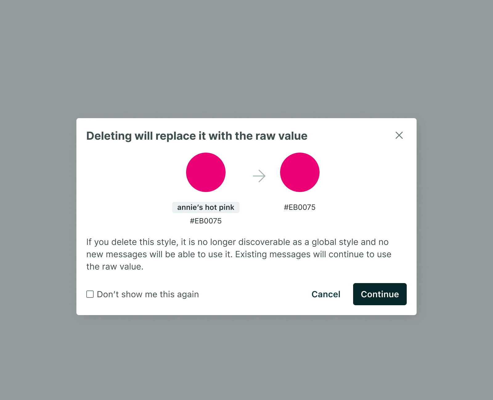
Styles should have variants
Considered
If a user wants a different button or text style, they could update the existing one or create their own custom component.
Decided
Our standard components all have the ability to have variants, with one default set as primary. This lets users create an array of buttons or image styles and easily swap the design with a dropdown.
This work wasn’t launched immediately. But tracking customer requests showed it was one of the top asks, and I used that data to get it prioritized. It shipped in early Q2 2026.
Decision 04 / 04
Visual component creation, locked first
Considered
Build the full vision: a visual way to create any custom component, with editable properties and content slots, matching what's already possible when a component is hand coded.
Decided
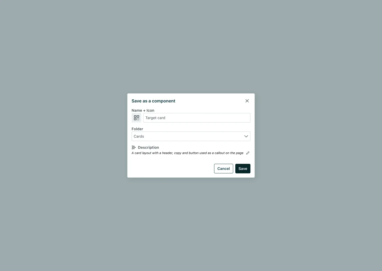
Ship a smaller first phase. From the visual editor, a user can select a block and save it as a locked component, one with no editable properties, which is exactly right for something like a footer or header that shouldn't change per message. I also pushed for the ability to detach a saved component back into its individual, editable blocks within a single email, so someone isn't stuck if they need a one-off exception, or need to translate the text inside it.
The mocks for the fuller version, visually defining properties and content slots on a component, are done, but not built yet. Locked components didn’t require touching the templating language at all, which is what made them shippable first. Full documentation on saving and detaching components.
Results
Creating components is one of the highest used features in Design Studio, and the majority of users have added all of their styles and are using them in messages.
What I’d do differently
The gap this opened is upstream. People still have to add their styles by hand or scrape them from their site before variants can help them. I’d have liked to solve that at the same time, instead of treating it as the next release.