The friction map
How I decided what to fix next in Design Studio
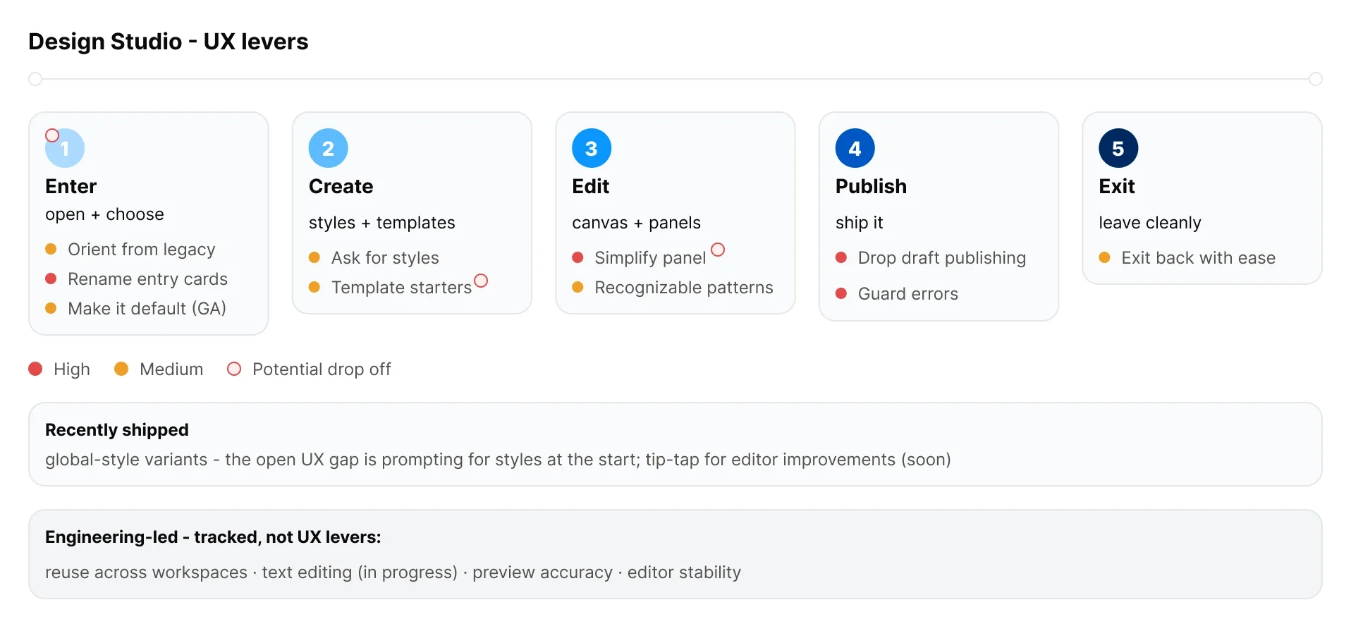
How I decided what to fix next in Design Studio. Beta feedback was arriving from six channels at once. I built a map that separated the problems I could solve in UX from the ones I couldn’t, ranked them by evidence, and turned that into a proposed end to end flow.
The challenge
Design Studio was in beta and working. That was the problem I had to reason about carefully, because a healthy funnel and a loud feedback channel look the same from the inside.
Feedback was coming from support tickets, NPS, customer calls, review sites, our issue tracker, and a beta feedback channel. All of it was real, none of it was ranked, and a lot of the loudest items were engineering problems I had no ability to fix. Meanwhile people were quietly opting out of the beta at a specific moment, and that barely registered anywhere.
What I owned
UX changes on the path from entering the editor to sending. I did not own editor stability, cross client rendering, or reuse across workspaces, which were the three largest themes by volume and all engineering led.
Naming that split explicitly is part of the work. It kept the proposal honest about what design could actually move.
Decision 1: Check the funnel before believing the noise
The feedback volume made it feel like the product was leaking users. It would have been easy to write a rescue plan.
I pulled the funnel numbers first. Activation was 82% over the last 30 days, up sharply from 62% the prior period. Publish retention was 94% and send retention 97%.
That changed what the proposal could honestly claim. These were polish and error prevention levers on a working funnel, not a fix for a collapsing one, and I said so at the top of the document. Overstating the problem would have bought a bigger budget and cost me credibility the first time someone checked.
Decision 2: Separate UX levers from engineering dependencies
The top themes by volume were editor stability, unreliable preview, and cross workspace reuse. Together they dwarfed everything I could act on.
I listed them anyway, in their own section, labelled as tracked dependencies rather than deliverables.
Leaving them out would have made the map look naive. Putting them in the same list as my own work would have implied I could fix them. A separate section let me show the whole picture and still be precise about scope.
Decision 3: Weight the quiet signal
Problems at the entry point barely appear in categorized dashboards. People who get confused and leave don’t file tickets, they just opt out, so the theme looks small.
I treated those as under-counted rather than absent, and put orientation from the legacy editor at the top of the proposed flow.
The evidence was qualitative and thin by design: a couple of opt-outs from people used to the old editor who couldn’t find rows and columns and described the new one as confusing. Two records against a theme with three hundred. But they were the users we were trying to convert, failing at the first screen, and no dashboard was going to surface that on volume alone.
Decision 4: Publish only when there’s something live to protect
Publishing was required everywhere, including on drafts and newsletters, and it generated over a hundred confusion records asking why a draft needed publishing at all.
I proposed removing publish from every context except active campaign messages and active transactionals, and gating those on a readiness check that turns red on blockers.
The argument for keeping it everywhere was consistency, one model, easy to explain. But the flow gap had already caused real harm. A customer duplicated a campaign, never connected the new message actions, never published to them, and the campaign sent with blank email bodies. Consistency wasn’t worth that. Publish earns its place when there’s a live version to protect, and nowhere else.
Results
A proposed end to end flow across five stages, each framed as today, proposed, and why, with an interactive prototype built as a companion.
Global style variants shipped during this work as a top long standing request, and the map showed exactly where it handed off to the next problem, which is that people still have to add styles manually before variants help them.