The editor
Design Studio's editor, now the surface more Customer.io accounts create email on than any other
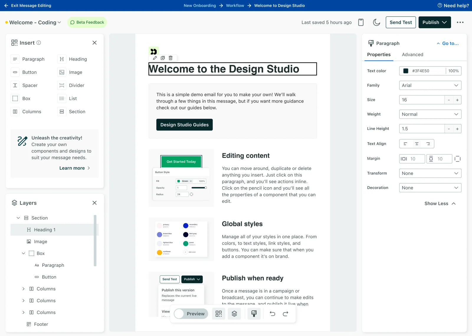
Design Studio is the content hub for a Customer.io workspace, and its editor is now the one more accounts create email on than any other, even while it’s in beta.
The challenge
Customers told us what was wrong:
“…if we update our footer… I have to go into every drag and drop email and basically add this saved row again.”
“To support our design needs we have an agency create our messages, but they are in code, and our marketers are not comfortable in code.”
There were no reusable blocks or templates, so it was hard to scale content or keep it consistent. Content could only be created inside an automation, so there was no way to organize it the way teams actually work. We had multiple editors across channels for different needs. The drag and drop editor, which we didn’t own, was missing features. Most users weren’t comfortable in code, which left them compromising on their design vision.
What I owned
I led design end to end: from the first interactions with a WYSIWYG editor, to the vision presentations that got leadership aligned on a multi-year investment, the strategy work with our triad, the interaction detail with engineering, and the specs for every part of Design Studio.
What’s in the editor
The editor is one surface of Design Studio, but the intent is an editor for all. Within it, customers can:

- Easily drag and drop content in, or simply type in the editor like a rich text editor
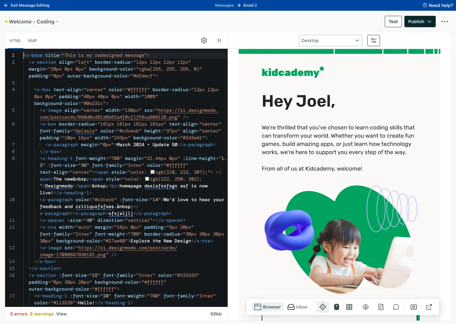
- Switch to code at any time and work in a code editor
- Switch to a preview mode with different views and filters
- Add personalization with a personalization menu
- Add adaptive properties to content, like a dark mode property on text or different padding on a button for mobile
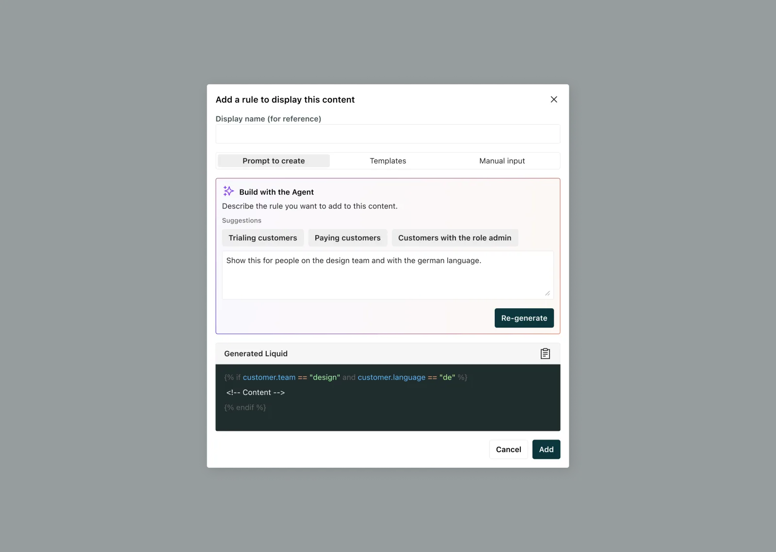
- Add conditional content easily with a natural language prompt or a condition builder
- Create language variations within a single message
- Save versions, with history you can create and manage
- Send a version to teammates for comments, feedback, and an approval process
Full capabilities are in the Customer.io docs.
What I explored
Two things we built to answer questions, not to ship.
In 2023 I designed a staged build toward full drag and drop: basic first, then rich text, then complete parity, opening each stage for feedback along the way. I made vision mocks to point the team at the end state, broke down every part of the editor and every state it could be in, and ran customer calls on specific interactions, like using a slash menu to add content. What we learned mattered more than the plan did. Customers could see where we were headed, but what was actually in production fell short of the drag and drop editor they already had, and that gap mattered more than the vision. That became the pivot point. We moved the work into Parcel, an email development platform we’d already acquired, and built there instead, with a smaller, more forgiving customer base who wanted a code editor with the bare necessities of a visual one, not immediate parity. That space is what produced Design Studio.
In 2024, once we had a direction, a different problem showed up. A Figma prototype can show what an editor looks like, but not what it feels like. We couldn’t tell if a selection state read as flashy, too bold, or too subtle until we could actually use it. I worked in a regular loop with our lead engineer who built a sandbox editor, pairing in code on things like color and the speed of a transition, deciding together in the running thing instead of handing off a spec for someone else to interpret. It ended up doing more than settle internal questions. We used it live on customer calls for validation, and it got us better feedback than a mockup could have.
While there were a lot of decisions over the years, these are a few to highlight.
Decision 01 / 04
One editor, two modes
Considered
We had a split audience. Marketers wanted to avoid code entirely. Agencies and technical teams built in code, and then marketers couldn't touch what they'd made. Serving both usually means building two tools, or building one that compromises for both.
Decided
I pushed for a single editor where you can work visually and switch to code at any point. But I purposely made the switch a tertiary action, not a visual toggle.
The quote about the agency was the whole problem in one sentence. Two separate tools would have preserved exactly that handoff gap. I also strongly felt that people would choose the environment they wanted to be in, and tested with users to feel confident in my decision. Beta feedback supported this. People who want the visual editor do not want to switch into a new IDE.
One learning did come back, though. People want the ability to see under the hood in specific parts, not to move wholesale into code. That was a clearer signal than the original request, and a much smaller thing to build than swapping out the entire editor.
Decision 02 / 04

Text first editor
Considered
Repeat the pattern of other visual editors, where pasted text arrives as one undifferentiated block.
Decided
Pasted paragraphs come in as independent components, and editing them works the way it does in a tool like Notion.
There’s more control in a visual tool when you approach text first. Each paragraph is treated as its own component. Copying from a tool like Google Docs carries the markup across, which makes editing easier rather than something to clean up afterward. With global styles in place, those paragraphs pick up the type styles a team has already defined, so consistency happens without anyone maintaining it.
Decision 03 / 04
Building toward drag and drop, not stopping at rich text
Considered
Build a basic rich text editor first, then add capabilities like drag and drop or complex layouts, like columns, on top of it, growing feature by feature.
Decided
Customers already had a rich text and drag and drop editor. Early testing on the experimental editor showed they wouldn't switch for rich text alone, they expected the same functionality they already had before they'd consider moving. We pivoted the work into Parcel and built to that expectation instead of building up from a smaller starting point.
Decision 04 / 04
Deciding interactions in code, not in specs
Considered
Spec interaction details, like the color and timing of a selection state, in Figma or written documentation and hand them to engineering to build from.
Decided
Build a working sandbox and decide those details together with our lead engineer, in code, rather than in a static mock.
Some interaction decisions can’t be evaluated until they’re something you can actually click and feel, not something you’re reading a description of. Using the sandbox live on customer calls also meant those decisions got tested against real reactions before they ever reached the production editor.
Results
After a closed pilot we moved to a slow beta rollout. Halfway through beta, about 85% of users said they’d continue using Design Studio, and feedback described the UI as intuitive and delightful. Customers reported workflow efficiencies and less dependency on outside resources like agencies and engineering.
By the end of Q2 2026, Design Studio had produced the most email designs of any editor every week since the quarter began, and more accounts were creating email on it than on any other editor. It passed the rich text editor on sending during the quarter.
Activation reached 82% over 30 days, up from 62% the prior 30. Publish retention is 94% and send retention 97%. Just over half of accounts complete more than 50 edits, which tells me people are using it as a working tool rather than trying it once. Around 2,900 editors are active weekly.
Design system impacts
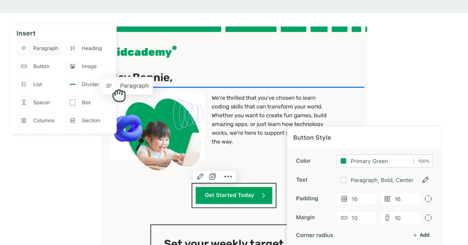
The editor needed a different UI than the rest of the application, and I wanted to honor that differentiation rather than force it into existing patterns. Our standard form labels were built for a form, not a properties menu, and our typography read too big and noisy at that density. I proposed a new floating panel pattern to solve it, sized and weighted for a canvas-like space, along with new property labels and editor-specific iconography.
That pattern didn’t stay contained to the editor. It’s since been adopted in other parts of the app that share the same canvas-like context, and it’s the same floating panel pattern the Auditor work later extended.
What I’d do differently
As our focus on Design Studio was on foundations, we chose as a triad to not offer off-the-shelf templates and components. As we continued work, self-serve customers were our lowest adopters. This was largely because they were faced with an empty canvas on start. With agent work upcoming, this is easily solved, but knowing what I know now, I’d have added some simple templates for users to start with.
There’s a second thing I’d change. Several of these decisions were deliberate departures from what people expected. Text as independent components rather than one pasted block. The code switch as a tertiary action rather than a visible toggle. I still think each one was right, and each one meant someone arrived expecting the norm and found something else. I under-invested in explaining those choices inside the product. That education needed to sit at the moment a person hit the difference, not in documentation they were never going to open.