The auditor
The QA layer inside Design Studio that catches what a sender can't see coming
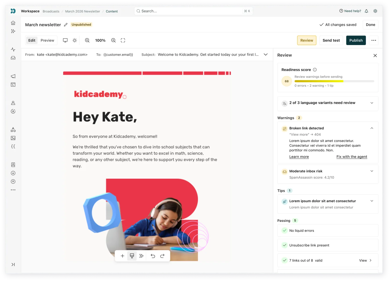
I designed the layer that catches what a sender can’t see coming, before it costs them a send.
The problem
Design Studio’s users send messages every day without any background in deliverability, accessibility, or email rendering. Most of what breaks a send is invisible to them until it’s too late. A custom font falls back to Times New Roman in Outlook. A CTA button sits at a 2.8:1 contrast ratio, below the WCAG AA minimum, unreadable to a meaningful share of recipients. A subject line runs 68 characters and gets clipped by Gmail at 60, cutting off the one word that mattered. A Liquid tag has no default value and fails silently at send time instead of throwing an error anyone would notice.
None of this shows up in open rate data until the damage is already done, and none of it is visible without knowing exactly where to look.
The checks already existed, image validation, spam risk scoring, accessibility rules, but they lived buried inside the code editor, built for developers, invisible to the person actually building and sending the message.
What I explored
The default pattern for this kind of tool is a single audit summary shown right before send, usually as a blocking modal. Early testing killed that fast. Someone testing an earlier version of a QA concept told me she felt finished with her message, then saw a wall of red and suddenly felt like she wasn’t finished after all. That reaction shaped everything that came after it.
I also looked at whether the 0-100 readiness score should double as the send signal directly, lower score meaning more caution. That fell apart the moment I modeled a message with a single blocker and nothing else: it scored a 60, which looks like a middling, probably-fine number, when the message actually can’t send correctly at all.
What I owned
I designed the audit model itself, not the individual checks. Each finding maps to a validator Design Studio’s code editor already used: Liquid syntax, image validation, spam risk, accessibility rules. My scope was the layer built on top of those: the three-tier severity model, the scoring formula and why its color is decoupled from the number, where and when each finding surfaces, and the language each finding uses to explain itself to someone with no technical background. I also added a “fix with agent” action so users could quickly remedy issues, and put passing checks at the bottom, to build trust by showing everything reviewed, not just the problems.
I prototyped all three moments end to end, from the inline signal during editing through both post-send states. Engineering owned wiring the surfacing into the live editor.
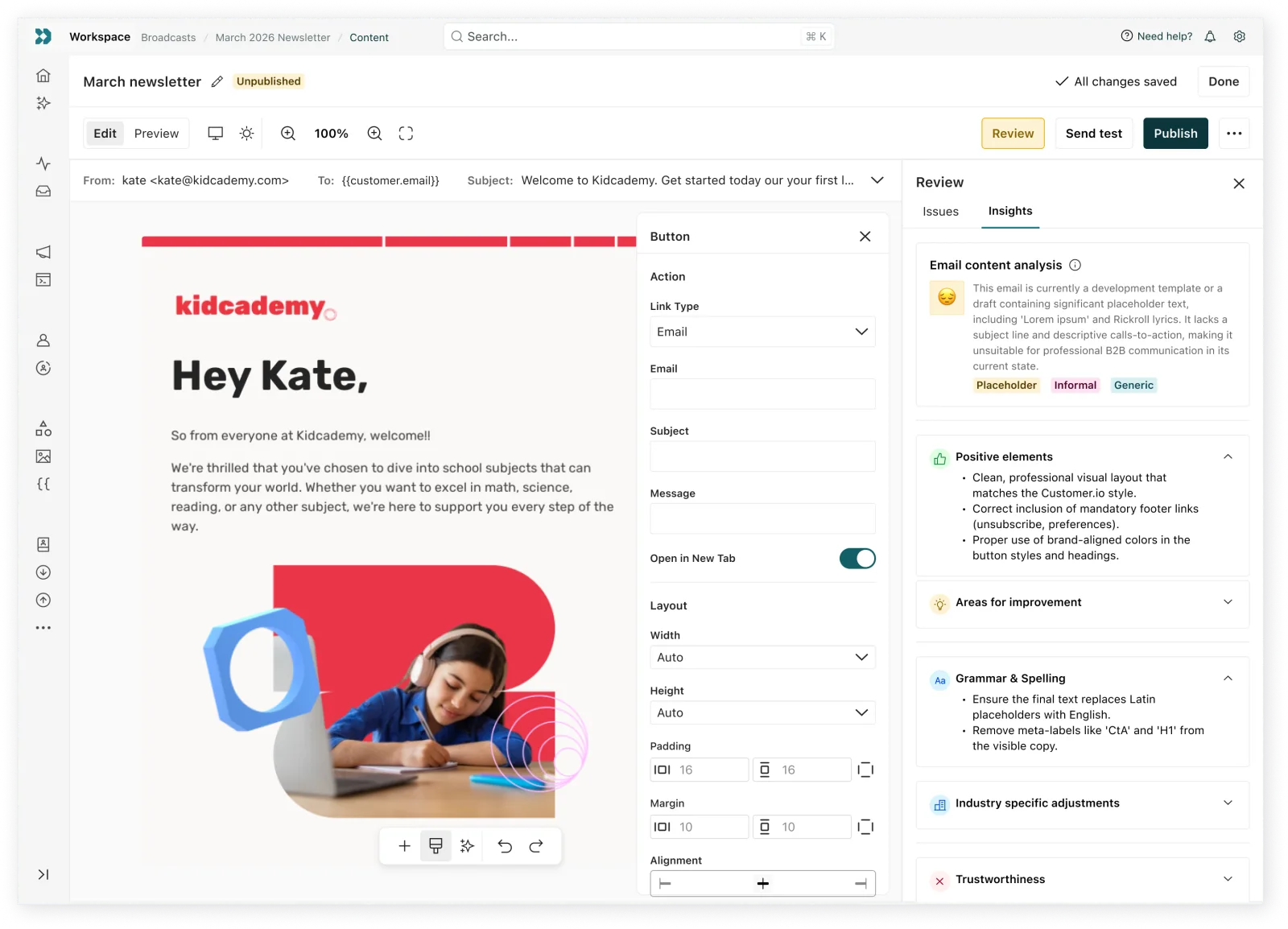
While there were a lot of decisions in this work, these are a few to highlight.
Decision 01 / 04
Decoupling the score from the readiness color
Considered
Tie the red, yellow, and green readiness label directly to the 0-100 score. Below 50 is red, 50 to 80 is amber, above 80 is green.
Decided
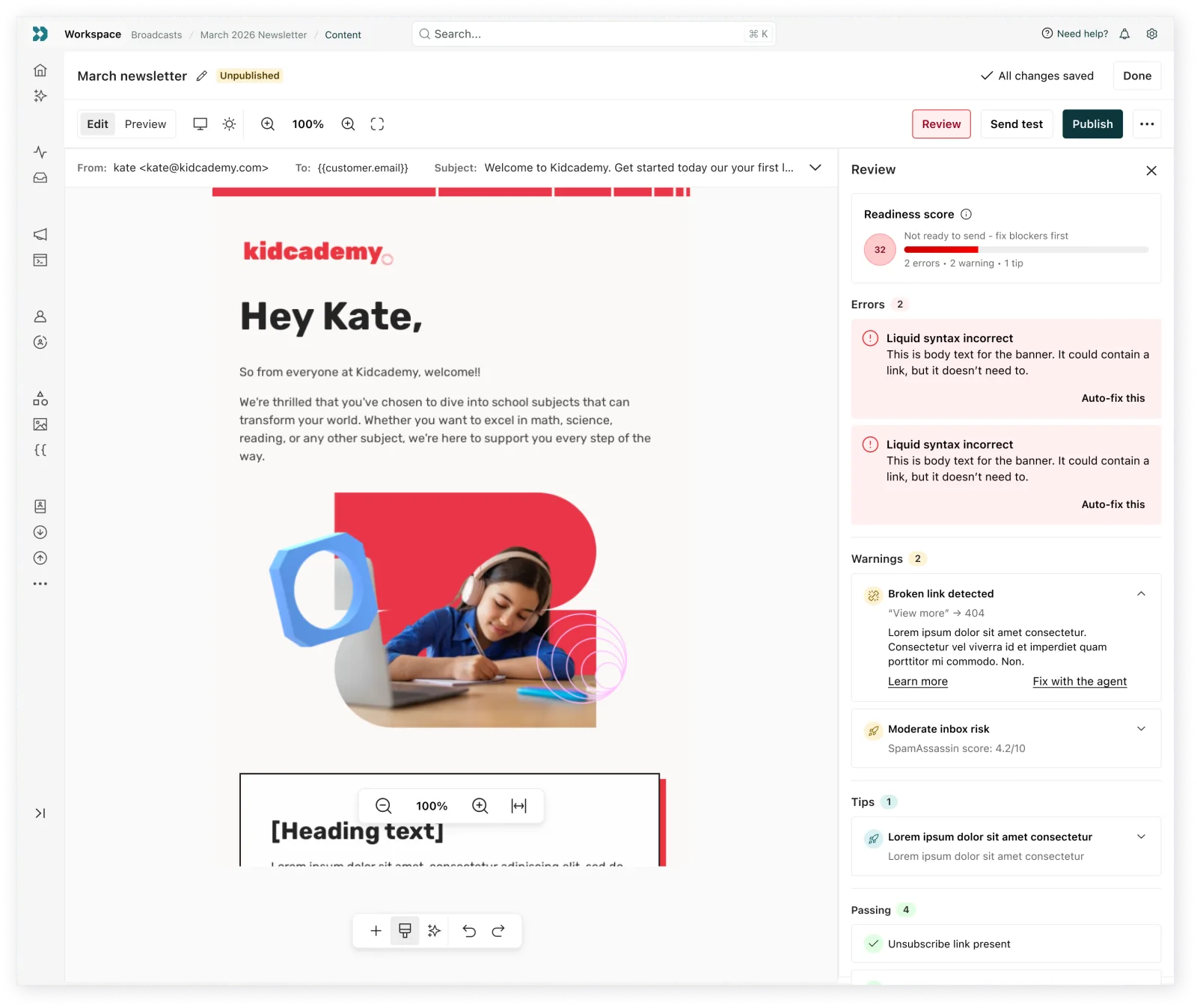
The color and label are set only by the most severe issue still open, never by the number. A message with one broken Liquid tag and nothing else scores 60, which under a number-tiered system would read as borderline okay. Instead it's red, not ready to send, regardless of the number.
A clean message with a handful of best-practice tips can lose a few points and still land at 90, which stays green. Tip penalties are also capped at 10 points total no matter how many accumulate, so a message with zero real problems can’t drift into looking risky. The number is a progress meter. The color is the honest answer to whether it’s safe to send.
Decision 02 / 04
Advisory only, never a gate
Considered
Block the send button when blocker-level issues are open, the standard pattern for most QA tools.
Decided
The Auditor never disables Send or Schedule. A blocker gets the loudest available nudge, a red, pulsing button and an inline badge, but the person can still send past it.
The earlier user-testing reaction, feeling finished, then suddenly not, then stressed, is why. The tool’s job is to inform someone who already knows her work, not to override her judgment.
Decision 03 / 04
Three moments instead of one audit gate
Considered
One audit summary shown right before send, the pattern most similar tools default to.
Decided
Findings surface at three separate moments. A quiet inline signal appears on the element itself while editing, no modal, no interruption. A review panel with a live badge count opens before send, showing issues sorted into three tiers plus a running list of what's already passing. A single callout card appears inside the analytics report after send.
Splitting the moments matters because a single end-of-flow modal gets dismissed and ignored within weeks. Each moment only asks for attention when it’s actually relevant to what the sender is doing right then.
Decision 04 / 04
Where the post-send card stops
Considered
Let the Auditor build its own post-send performance views, trend comparisons, something closer to a small analytics dashboard tied to audit findings.
Decided
One card, placed inside the analytics layer's existing campaign report, a screen the Auditor doesn't own. It states only what it actually knows, the audit findings that were open or resolved at the moment of send, phrased as "may have contributed" rather than "caused."
Retention curves, open rate trends, and benchmark comparisons stay with analytics. The moment the card started explaining performance instead of annotating it, it would start duplicating a part of the product that already does that job.
Results
This shipped as a fully specified design, not yet as a measured feature. I prototyped every state across all three moments, wrote the scoring formula and tier logic, and handed off a specification detailed enough to build from: exact penalty values, exact trigger conditions for each check, and the auto-fix behavior for the checks where a fix is unambiguous, contrast and Liquid fallback values among them. Development on the inline signal began alongside this work. I don’t have adoption or resolution-rate numbers to report here, because the feature hadn’t gone live at the point this case study was written.
Design system impacts
This design extended the floating panel pattern originally built for the editor, adding support for showing varying degrees of severity across action cards. Those additions are part of a proposal to formalize the floating panel as a shared component, not yet adopted system-wide.
What I’d do differently
I’d want real email-client distribution data per workspace before finalizing how the email-client-support check is weighted. It runs as a flat check today, but the plan was always to weight it by a workspace’s actual recipient mix once that data existed, and shipping the flat version first was a scope call, not a finished answer.
I’d also tighten the line between a genuine Liquid syntax error and a technically valid but risky pattern, like a fallback that silently renders blank, before broadening what counts as a blocker. Getting that distinction wrong either creates false alarms that erode trust in the tool, or lets a real failure through as a false pass.